
Currently reading

A Dirty Job

The Improvisational Cook

London Under: The Secret History Beneath the Streets


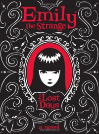 Emily's cult following began many years ago. She's been in the periphery of my awareness where strange things tend to accumulate. I'm glad I looked more closely.
"OK.
I think I better take some notes, cuz something super strange is happening to me, and I don't know
1. my name
2. anyone else's name
3. where I am
4. how I got here
5. where I live
6. how old I am (am I a kid or just short?)
7. anything I've done since I was born
8. whether I'm a cat person or a dog person
9. whether I actually believe people are either cat people or dog people
10. what might have been written on the eleven pages that were torn out of this notebook
11. why this happened to me
12. how long it's going to last, or
13. what I should do next."
 "History is that certainty produced at the point where the imperfections of memory meet the inadequacies of documentation." (p. 17)
"If I can't be sure of the actual events any more, I can at least be true to the impressions those facts left. That's the best I can manage." (p. 4)
"It strikes me that this may be one of the differences between youth and age: when we are young, we invent different futures for ourselves; when we are old, we invent different pasts for others." (p. 80)
 "I see short writing. I collect it all in my daybook: haikus and sonnets, aphorisms and parables, prayers and insults, bumper sticker slogans and T-shirt rhymes, blurbs, titles, ads, street signs, marginalia, bulleted lists, song lyrics, announcements, propaganda, and names, names, and more names. I can also go new-school: tweets, blog posts, updates on social networks, e-mails, text messages, and more." "You will run into great short writing in the most surprising places, from restaurant menus to rest room walls. Record these in your daybook or snap photo with your cell phone." (chap. 1)
 "Tread carefully over the pavements of London for you are treading on skin, a skein of stone that covers rivers and labyrinths, tunnels and chambers, streams and caverns, pipes and cables, springs and passages, crypts and sewers, creeping things that will never see the light of day." (p. 1)
"The bombing of the Second World War marks the emergence of proper archaeological investigation in the city. The bombs destroyed London's present but helped to rebuild London's past. They revealed Roman London, for example, and the extent of the great Roman wall around the city became known." (p. 20)
"The presence of holy water induced various forms of theatre and ritual in its vicinity, perhaps in memory of earlier water cults and ceremonies. The Clerks' Well and the Skinners' Well close to one another in Clerkenwell, for example, were the site of the London mystery plays in the late medieval period. The well of the clerks can still be seen, behind a glass window at the turning of Farringdon Lane into Clerkenwell Green. Some broken stone steps lead down to the well, from which many generations of pilgrims or travellers drank." (p. 32)
 1
1
 "Geographers submit to a tacit agreement to obey certain mapping conventions, to speak in a malleable but standardized visual language. Artists are free to disobey these rules. They can mock preoccupation with ownership, spheres of influence, and conventional cultural orientations and beliefs." (p. 10)
"Creative geographer and author Denis Wood writes, "Map artists...claim the power of the map to achieve ends other than the social reproduction of the status quo. Map artists do not reject maps. They reject the authority claimed by normative maps uniquely to portray reality as it is, that is, with dispassion and objectivity." " (p. 13)
"Artists chart singular perceptions rather than assert meaning for any collective truth." (p. 15)
[These are map artists, not cartographers per se.]
 Helpful before and after designs (i.e., how to fix a design). Encourages exploration of different layouts. Provides definitions of all elements of design.
"Effective grouping streamlines the viewer's search for meaning and information [and navigation of the content]. The designer helps the viewer by deciding which (and how) elements should visually relate to each other." (p. 43)
"A lack of clear visual ranking between elements is perhaps the single most common failing of design. When this happens, the piece either fails to attract interest, or loses the interest of a viewer after it has been gained." (p. 61) "Avoid a fainthearted approach when making these decisions. Be decisive." (p. 64) "Visual indecision weakens structure; avoid it!" (p. 81)
"Even an artist of modest ability can consistently create work of impact and effect if they have cultivated a precise and honest sense of evaluation. An inaccurate set of evaluation skills undermine the creative efforts of even the most (otherwise) capable designer." (p. 97)
"Just as a person might feel uncomfortable in a confined space, the eye also feels uneasy when it finds itself presented with no way out. Many viewers, when confronted with trapped visual space [white space - especially in the center of the layout], feel a distinct, though difficult to define, sense of unease." (p. 114) [unless it's done intentionally for effect]
"Typographically speaking, it is generally best to avoid placing flush-left (ragged right) text next to a strong vertical division such as an image or block of color." (p. 115)
Evaluating Composition ("CAP"):
- Connection - Can adjustments be made (large or tiny) to create more relevant connections between elements? If so, can changes be made to make fewer and more logically related groups of items within the layout? If this is a multi-page design, are there strong visual and thematic connections between the pages?
- Alignment - Have I checked the alignment of each element to make sure nothing has been overlooked? Are there exceptions that could be allowed that would enforce the message?
- Priority - Is there a clear and appropriate hierarchy between elements? Is there a good balance of color and value and are both acting to bring attention appropriately to their subject matter or area of a design? Does the eye feel pulled in opposing directions or drawn off the page by the composition? (p. 121)
"The next time you begin to put ideas and thumbnail sketches together for a project, consider this approach: adopt the alter-ego of a brilliant wildman or wildwoman of design and lay siege to your book with a take-no-prisoners creative onslaught. (Go big or go home, as they say.) Save quality-control and finalization until several hard-earned pages of the sketchbook have been filled... Remember: it's far easier to scale back a far-out concept or composition than it is to bolster the personality of a lackluster solution." (p. 153)
"Styles between images should be either identical, or noticeably different." For example: "Contract in style, agreement in theme." (p. 200)
"The art of rationalization, applied to the retionalization of our art: it's the slow, slinking slide into creative oblivion that cools the original spark that first fired our imagination toward the manifestation of an artistic goal... Designers sometimes do similar things when choosing spot colors, typefaces or deciding on the cropping of an image - accepting easily the readily available solutions without comparing those choices against the look or feel that they were aiming for when they began the project. Hold true to your original creative impulses. Avoid the temptations of shortcut and convenience as you journey toward their realization." (p. 205)
"A well-chosen color of ink can be flooded over a surface, featured in any number of lighter tints or combined with one or two other inks for cost-effective impact." (p. 220) "Never underestimate the power of a simple palette." (p. 225)
Evaluating Components ("CAP"):
- Connotation - Is every sub-component within the element working toward the same thematic goal? Could color, proportion, quality-of-finish or font choices within this graphic element be adjusted (if even slightly) to better reflect its message?
- Attributes - Could linework be thickened, made thinner or "roughened up" in order to better establish the element's aesthetic and thematic integrity? If so, does the element stand out clearly and is it in thematic agreement with the backdrop? Will the color scheme of each element fit in well with the scheme of the larger layout in which they are placed? Is the text large enough for the intended audience to easily read? Is it time to look for new fonts?
- Placement - Should it call attention to itself or go virtually unnoticed? What sort of placement should this graphic element be given within the composition? Should its edges align with other elements within the layout? if so, will it conform to the same alignment conventions that apply to other elements in the composition (flus left, flush right, centered, etc.)? Once placed within a layout, should the element be further cropped, rotated, moved, sized or altered in any way? (p. 275)
"Obscurity can be used as a theme and as way of delivering theme. Most people find it hard to resist a well-presented puzzle, actual or thematic... Juxtaposition (a combination of objects that seem to be at cross purposes or without an obvious reasons for their association) can be used to generate intrigue, ambiguity and humor. Juxtaposition, when used effectively, takes advantage of people's natural tendency to investigate the deliciously obscure." (p. 310)
"Use instinct and logic to tell you whether each aspect and element of a design are working toward the delivery of the same message. Avoid adding elements that have a separate agenda, no matter how attractive they might be on their own." (p. 321)
"Fill your creative reservoir by training your eyes to SEE and your brain to ABSORB... Read. Read the classics, read pulp fiction, read a variety of magazines. Read before bed, read during lunch, read on the weekend. Read solo or as part of a group... Learn a musical instrument, borrow or buy a digital video camera, become a better cook, act. Creativity gained in one medium invariably spills over into others." (p. 326)
"Create a savings account of images - one that is always available for reference and use in personal and professional projects. A suggestion: purchase a camera and get in the habit of taking it with you wherever you go... Over time, you will build up a stock of banked images that can be used as featured photos, backdrops, visual textures and reference material for your work." (p. 202)
Evaluating Concept ("CAP"):
- Clarity - Is each working toward the same overall message and goal? Is there more than one message fighting for attention here?
- Audience - Who does the client think their primary audience will be? What can you do to be sure of your conclusions? What sort of lingo might they respond to? Does the concept behind this piece talk down to the target audience? What can this product or announcement provide that the audience wants, needs or desires? If this piece were a person, what would she/he look like and how would they behave?
- Purpose - Is it meant to sell a product? Is the purpose to inform or persuade? Have you discussed the purpose with your client or art director? If not, what can be left out in favor of a more focused presentation? (p. 339)
